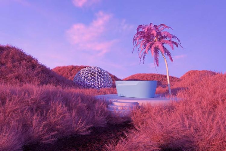
Digital Colour Design Trends of 2022
Think playful pastels, primary colour takeovers and eco-friendly earth tones – 2022 is the year of reimagined digital colour design trends.
Digital Colour Design Trends of 2022
Written by Laura Endeacott
The reading and writing geek with red hair, who also enjoys dreaming up people's brands. WHO are you, WHY are you and "oh that's' a nice picture of a dog!"
February 11, 2022
Imagine a world without colour. Now imaging a WEBSITE without colour – not very captivating, and a bit like being smack bang in the middle of a black and white film.
In the web design industry, we tend to be flooded with articles about, “the perfect colour combo” and “classic palettes that never fail in website design”, but do these influence the digital colour design trends that occur?
First on the list of designing a website is choosing your colour palette to represent your brand. Before you become dead set on a palette, consider what mood it will communicate to your visitors. Using colour as psychology in design is used because it demands certain reactions and you’re just hoping it’s the ones you want to invoke.
Designers are pushing the digital envelope in 2022 by reimagining pre-loved favourites and modernising them right back into the basics. Prepare to see the digital colour trends that are going to be used throughout many website designs today.
Pastel Gradients
No more are pastels only used for baby interior design. These playful hues lend themselves to the digital design spotlight, which adds an elegant sense of calm and playfulness.
This is where colour is now referred to as an “aesthetic” and the pastel website you have just created can now be an inspiration to be worn! Playing with pastel saturation, gradients and pairing them with colour combinations is a mark of the overall theme of this year – to push the creative boundaries.
Earthy Tones
It seems in the design world, there has been a gradual shift in standing out from bright colours and geometric shapes to using more muted tones and organic design. Natural earthy tones hit reset on the fast-paced material out there and dial the message down into a friendly brand next door.
Inspired by the world’s more conscious movement towards environmentalism and sustainability, the rich browns and muted beiges signify a more thoughtful approach to design and your marketing message as a whole.
Primary Colour Blocking
Using primary colours, specifically red, yellow and blue to emphasise vibrancy, boldness and youthfulness have been used in design for centuries to capture the audience’s attention. This kind of colour blocking paired with simple design aspects has now risen to fame again to emphasise a clean, but bold visual statement.
Not only left to the designs of childlike brands and businesses, now any brand that wants to adopt a highly saturated primary palette can do so, to stand out in the sea of “grown-up” tones. We liked it so much, we currently rock primary colours in amoungst our staple brand favourites of black and white.
Black Alsatian’s expert geeks and geekesses have a ton of experience with WordPress – the proof is in our trend-setting website. Be the next jaw-dropping centrepiece in your industry. Join the Black Alsatian fam!
Retro 80’s is Back!
Back to the future is back and wormed itself into the design world to takeover. We’ve seen it in the cycle of fashion trends, where old and retro is back and even made new again. Retro 80’s design elements are nostalgic and offer feelings to customers of cheerfulness and relaxation, by using bulkier fonts and reminiscent graphics.
We have all recently collectively gone through tougher times, so working a little bit of retro magic into your website’s aesthetic, allows you to take people back to the good and less complicated times.
Colour of the Year: Very Peri
The Pantone colour of 2022 has been announced for the year and this is where the colour experts weigh in on the colour trends by searching for new colour influences through many different mediums.
Very Peri PANTONE 17-3938 is the trendsetting colour of today, which displays a spritely, joyous attitude with its qualities of blues mixed with violet-red undertones.
This colour choice solidifies the uplifting trend of 2022 to inspire creatives to push their imaginations in the digital and physical space, but also reminding us all of the endless possibilities the future may hold.
Wix, Go Daddy and Shopify too frustrating to navigate by yourself? We can assist you with designing a bespoke WordPress website you can call your own – but without the fuss. Call, WhatsApp or mail us any time and let’s collaborate.
Our Take Away
If you have set yourself the task of designing your website or refreshing your overall brand, keep these trends in mind and use them to inspire you creatively. Staying ahead of the curve is a great way to position your business in the marketplace and allows potential customers to recognise you from the pack.
Whether it’s playful pastels, primary colour blocking or eco-friendly earth tones – 2022 is NOW and now is your year for change!


